The long-run supply curve shows how an industry's total output responds to price changes over a period long enough for everything to be flexible. This means new companies can enter the market, and existing ones can pack up and leave.
What Is the Long-Run Supply Curve?
Imagine a local coffee shop. In the short run, its options for boosting output are pretty limited. To handle a sudden rush, the owner can hire more baristas or order extra coffee beans. But they can't instantly build a new location or install a bigger, better espresso machine. Those things are fixed, at least for now.
The long-run supply curve zooms out from this immediate picture. It asks a much bigger question: what happens to the entire coffee industry if the demand for coffee goes up and stays up? In the long run, everything is on the table.
- Firms can enter or exit the market. If coffee shops are making great profits, you'll see new ones pop up. If they're struggling, some will inevitably close their doors.
- All production inputs are variable. Businesses can build new facilities, invest in next-generation technology, or even relocate to more strategic areas.
- The market finds a new equilibrium. The curve tracks how the industry’s total output changes after all these adjustments have had time to play out.
This concept moves us from looking at a single firm's reaction to watching how an entire market evolves. Before going further, it’s helpful to have a solid grasp of the basic forces at play. For a great refresher on these fundamentals, check out Colibri Trader's market drivers insight.
From a Snapshot to a Time-Lapse
A good way to think about it is that the short run is like a snapshot photo. It captures a business at a single moment, locked into its current size and only able to adjust flexible inputs like labor. A short-run supply curve shows what a firm can produce within those fixed constraints.
The long run, in contrast, is like a time-lapse movie. It shows the entire landscape changing as new factories are built, technologies are adopted, and competitors enter or exit the scene.
This distinction is precisely what makes the long-run supply curve so insightful. It’s not just about what one business can do today, but how an entire industry rearranges itself over time when all barriers to change are removed. That freedom, especially the ability for firms to enter and exit, is what truly shapes an industry’s long-term trajectory.
How the Long-Run Supply Curve Is Derived
The long-run supply curve isn't some abstract concept you'll only find in a textbook; it tells a dynamic story about how an entire industry breathes and adapts over time. It's the result of countless individual firms making decisions in response to the market's signals. To really understand where it comes from, let's start with a perfectly competitive market that's in a state of calm, or what economists call long-run equilibrium.
In this balanced state, all the firms in the industry are making zero economic profit. Now, this doesn't mean their bank accounts are empty. It simply means they're earning just enough to cover every single one of their costs, including the often-overlooked opportunity costs of their capital and effort. The market price has settled right at the minimum point of each firm's average total cost, so there's no real motivation for anyone to enter or leave. Everything is stable.
The Market Responds to a Shock
So what happens when we disrupt this perfect balance? Imagine a sudden surge in demand. Maybe a new study comes out touting the health benefits of the product, and suddenly everyone wants more of it. This shoves the market demand curve to the right, which in turn drives up the market price.
For the individual firms already in the market, this is great news. Their costs haven't changed, but the price they get for each unit sold has gone up. Suddenly, they're enjoying positive economic profits. These short-term profits are a powerful signal. Think of them as a bright neon sign flashing "Opportunity!" for entrepreneurs.
Profits act as a powerful magnet in a competitive market. They signal an opportunity, telling new businesses where resources are most valued by society.
This is a perfect example of how markets direct resources. To really get the full picture of long-run supply, it helps to understand how resources are allocated in the first place, a core concept explained by mastering comparative advantage for MUN. This principle of efficient allocation is the very reason firms are drawn to profitable markets.
The Path to a New Equilibrium
That flashing neon sign of profit doesn't go unnoticed for long. Attracted by the chance to make money, new firms start entering the industry. As each new competitor fires up its production lines, the total market supply starts to grow, pushing the short-run market supply curve to the right. This flood of new supply naturally starts to bring the market price back down.
This entry process continues as long as there's still a profit to be made. The doors to the market only close once the price falls all the way back to the original level, the point where it just covers the minimum average total cost. At this stage, economic profits have vanished, returning to zero, and the incentive for new firms to enter is gone.
The diagram below visualizes this entire journey, from the initial shock and short-term scramble to the industry's long-term evolution.
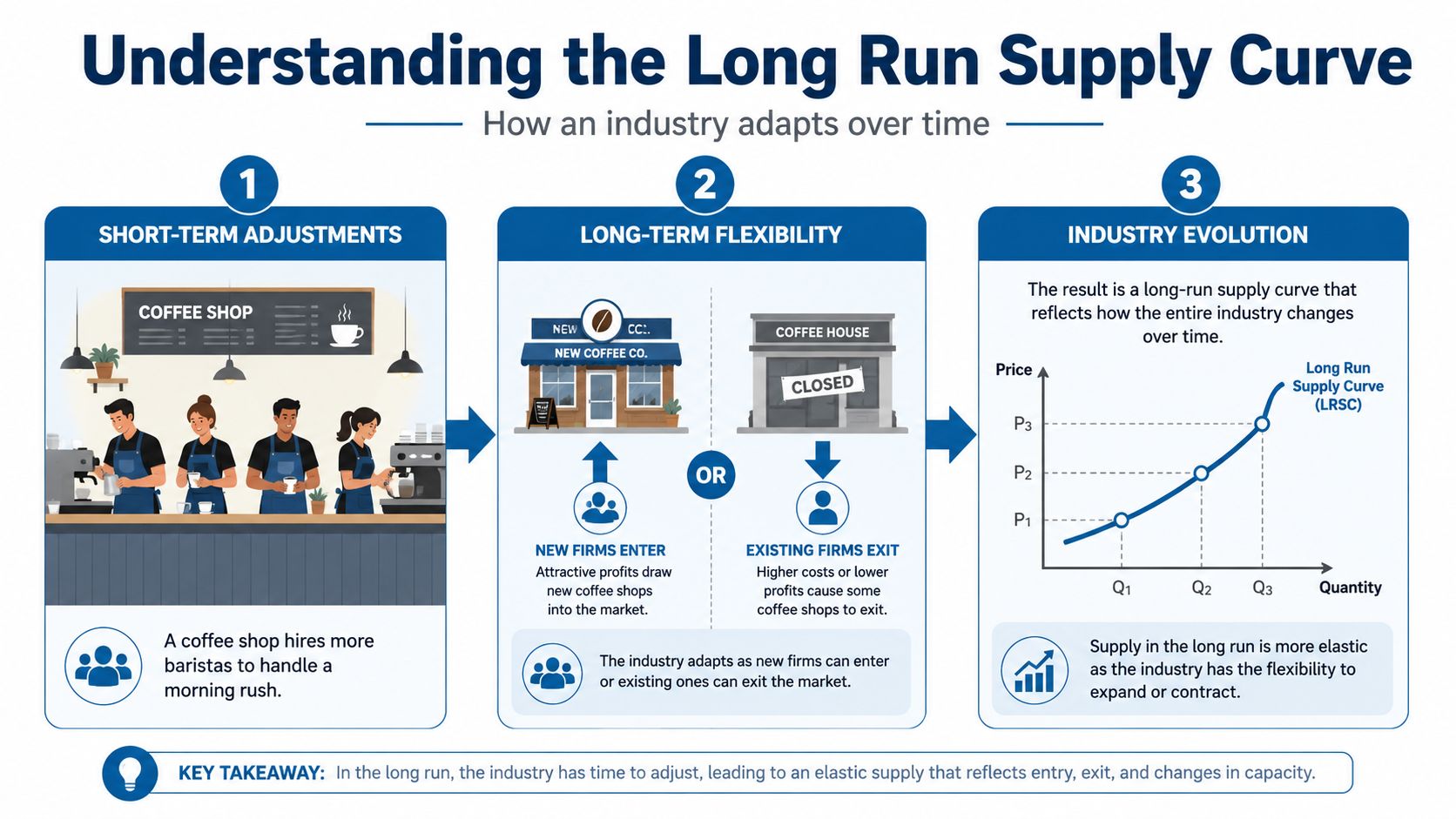
So, how do we get the long-run supply curve from all this? We simply connect the dots between the starting and ending long-run equilibrium points. This line reveals the relationship between price and the total quantity supplied after the market has had enough time to fully adjust through firms entering or exiting. For those who enjoy the math behind these economic models, you might appreciate our guide on core concepts in calculus.
The Three Shapes of the Long-Run Supply Curve
Ever wonder why you can buy a generic t-shirt for about the same price today as a decade ago, while the cost of specialized, handcrafted furniture seems to keep climbing? The answer is hidden in the way an industry’s costs react to its own growth. The long-run supply curve isn't a one-size-fits-all concept; its shape tells a unique story about the economic engine driving an industry.
This curve can take one of three primary forms. Each one is determined by what happens to production costs when new companies jump into the market and the total industry output expands.
Constant-Cost Industries
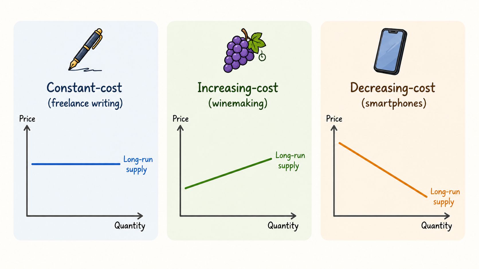
The most straightforward case is the constant-cost industry. Its long-run supply curve is perfectly horizontal, a flat line. In these markets, the industry can expand without affecting the cost of inputs for individual firms.
Think about the market for freelance content writing. The main inputs are a writer, a computer, and an internet connection. If demand for online articles suddenly doubles, thousands of new writers can enter the field without much friction. This influx of talent doesn't really drive up the price of laptops or internet service for everyone else.
Because those input costs stay stable, new firms can produce at the same minimum average cost as the ones already there. As a result, the long-run price holds steady, even as the total quantity supplied to the market grows.
Key Takeaway: In a constant-cost industry, firm entry and exit ensure the market price always returns to the same minimum average cost. The long-run supply curve is perfectly elastic.
The agricultural sector often provides a great real-world example. For decades, the long-run supply curve for U.S. wheat has been almost horizontal. Despite a staggering 40% increase in production volume, prices have stayed in a relatively narrow band, showing the industry can scale up without driving its fundamental costs through the roof. You can learn more by exploring how different industry cost structures shape supply in more detail.
Increasing-Cost Industries
Now, let's look at the most common scenario: the increasing-cost industry. This type has an upward-sloping long-run supply curve. As this kind of industry expands, it actually drives up the price of its own key inputs.
Picture an industry that relies on a scarce, specialized resource, like winemaking in a region with limited "ideal" grape-growing land. As demand for that specific wine grows and new wineries open, they all start competing for the same finite, high-quality land. This competition inevitably bids up the price of that land for every single winery in the area.
This means that as the industry gets bigger, the average costs for all firms begin to rise. To keep profits at zero in the long run, the new equilibrium price must be higher than the original. This dynamic creates an upward-sloping supply curve, showing that higher prices are needed to coax more supply out of the market over the long haul.
Decreasing-Cost Industries
Finally, we have the rarest but perhaps most interesting case: the decreasing-cost industry. Here, the long-run supply curve actually slopes downward. This counterintuitive shape means that as the industry expands, production costs for all firms actually fall.
How is this possible? This usually happens in industries with powerful economies of scale. Consider the early days of smartphone manufacturing. As more firms entered the market and production ramped up, they collectively created a larger, more efficient ecosystem. Component suppliers could produce at a massive scale, which drove down the cost of processors, memory, and screens for every single manufacturer.
The result was that industry expansion led to lower production costs, which in turn led to lower prices for consumers. This downward-sloping curve reflects an industry that gets more efficient as it gets bigger.
The relationship between industry growth, input costs, and the supply curve's shape is fundamental. The table below summarizes these three scenarios.
Industry Cost Structure and Long Run Supply Curve Shape
| Industry Type |
Effect on Input Costs as Industry Expands |
Long Run Supply Curve Shape |
Example Industry |
| Constant-Cost |
Input costs remain unchanged. |
Perfectly elastic (horizontal). |
Agriculture (e.g., wheat), freelance writing. |
| Increasing-Cost |
Input costs increase due to scarce resources. |
Upward-sloping. |
Oil extraction, specialized winemaking. |
| Decreasing-Cost |
Input costs decrease due to economies of scale. |
Downward-sloping. |
Early-stage electronics, smartphone manufacturing. |
Understanding which category an industry falls into gives you incredible insight into its long-term pricing and production behavior. It explains why some prices seem stuck in time while others are always on the move.
Comparing Short-Run and Long-Run Supply
It’s easy to get tangled up in the difference between short-run and long-run supply. The best way to untangle it is to stop thinking about a specific amount of time, like a few months or a year. Instead, think about flexibility.
The short run is like a snapshot in time. A business is working with what it's got. For a local pizza place, this means they can hire more cooks or order more dough and cheese to meet a sudden rush. But they can't magically install a bigger oven or expand their dining room overnight. At least one of their inputs, in this case, the oven and the building, is fixed.
Now, picture the long run as a time-lapse movie of that same pizza business over several years. Suddenly, anything is possible. The owner can lease a larger space, build a second location, or invest in a massive new oven. Just as importantly, other entrepreneurs might see the pizza place's success and decide to open their own shops nearby. And if the market gets too crowded, our original owner might even decide to sell and get out of the pizza game entirely.
In the long run, every single production factor is variable.
The core distinction is freedom. Short-run supply is constrained by fixed inputs, while the long-run supply curve reflects an industry's total capacity after all constraints are removed and firms can freely enter or exit.
Key Dimensions of Comparison
This difference between being locked-in and being totally flexible leads to very different behaviors and market outcomes. Once you grasp these key distinctions, you'll have a much clearer picture of how markets evolve.
Let's break it down:
- Flexibility of Inputs: This is the big one. In the short run, you're stuck with your current factory, machinery, or store size. In the long run, you can change anything and everything about your operation.
- Firm Entry and Exit: The number of players in the game is fixed in the short run. But in the long run, the market is an open door. New firms can jump in if they see a chance for profit, and struggling firms can leave.
- The Role of Profits: In the short run, making a profit (or a loss) is a powerful signal. Big profits scream "Come join us!" to new entrepreneurs. Losses tell existing firms to consider packing it up. These signals are what cause entry and exit, which in the long run, tends to drive economic profit down to zero in a perfectly competitive market.
This table puts it all side-by-side.
| Feature |
Short-Run Supply |
Long-Run Supply |
| Inputs |
At least one input (e.g., factory size) is fixed. |
All inputs are variable; firms can change anything. |
| Number of Firms |
The number of firms in the industry is fixed. |
Firms can enter or exit the market freely. |
| Economic Profits |
Firms can earn positive, negative, or zero economic profit. |
Economic profit is driven to zero by entry and exit. |
| Curve Shape |
Always slopes upward as firms produce more at higher prices. |
Can be upward-sloping, horizontal, or even downward-sloping. |
A long-run supply curve isn't set in stone; it's a dynamic line that can, and does, move. It’s important to remember the difference between a movement along the curve, which is caused by a simple price change, and a shift of the entire curve. A shift signals a much more fundamental change to the industry's underlying cost structure.
When the whole curve moves, it changes the long-run equilibrium price and quantity for every single firm in the market. In essence, anything that permanently alters the cost of production for the average company will shift the entire long-run supply curve. The main drivers are technological advancements, long-term changes in input prices, and new government regulations.
Key Drivers of a Shift
Technological breakthroughs are a classic cause of a shift. When a new invention or process makes production cheaper or more efficient, the cost to produce any given amount of a good falls. Think about how innovations in drilling technology drove down production costs across the entire oil and gas industry. This kind of change shifts the long-run supply curve down and to the right, meaning the industry can now offer more output at a lower price.
On the other hand, a lasting increase in the price of key inputs will shift the curve up and to the left. If a permanent global event causes a sustained spike in energy costs, every firm that relies on that energy faces higher expenses. This pushes up the minimum average cost, forcing the long-run market price higher just to keep businesses afloat. New government rules, like tough environmental standards requiring expensive equipment, can have the same effect by adding to the cost of doing business and shifting the curve upward.
A shift in the long-run supply curve signals a structural change in an industry’s productive capacity. A rightward shift signifies progress and lower costs, while a leftward shift indicates rising costs or new constraints.
The Big Picture and Economic Growth
These same principles also work on a macroeconomic scale, where improvements in an economy's overall productive capacity shift the aggregate supply curve. The very engine of economic growth is driven by these same kinds of fundamental improvements. Productivity enhancements are a key factor in expanding long-run supply. To see how policy can encourage these kinds of gains, check out Unitism's insights on productivity.
For example, the potential output of the U.S. economy exploded by 140% between 1960 and 2023, growing from $5.4 trillion to $21.4 trillion in real terms. This massive rightward shift didn't happen by accident. It was powered by:
- A 65% larger labor force
- A 220% increase in capital stock (machinery, infrastructure)
- A compounding technological progress rate of 1.2% each year
According to the Congressional Budget Office, these forces combined to fuel an average long-run growth rate of 2.3% annually. For a deeper dive into this history, you can explore the data behind long-run aggregate supply.
Once you understand what makes it move, the long-run supply curve is no longer just a static line on a graph. It becomes a dynamic indicator of economic health, technological progress, and structural change.
Long Run Supply in the Broader Economy
We've been looking at supply within a single industry, but now it's time to zoom out. Let's apply the same logic to the entire economy using the Long-Run Aggregate Supply (LRAS) curve. This is a core macroeconomic concept that shows why a nation's total output isn't really about price levels over the long haul.
Instead, an economy's potential is dictated by its fundamental productive capacity. Think of it like a recipe: the final dish depends on the quality and quantity of your core ingredients. For an economy, these ingredients are its available labor, capital stock (like factories and technology), and natural resources.
The LRAS curve is vertical because, in the long run, an economy produces at its full potential based on real resources. It isn't swayed by price tags. Because wages and prices are flexible, any changes in the overall price level don't actually change real output.
This vertical line on a graph represents the economy’s potential output. If inflation kicks in and prices rise across the board, wages and other costs eventually catch up. This leaves businesses with the same real production incentives as before, so output doesn't change. The only way to move this vertical line, to actually grow the economy, is to improve the underlying ingredients.
The Vertical Reality of Economic Output
For example, a new technology that makes workers more productive will shift the entire LRAS curve to the right. That’s economic growth in action. The same thing happens if the workforce gets larger or becomes more skilled.
This is a huge departure from the short run, where sudden price changes can temporarily trick firms into producing more or less than they normally would. Over the long run, though, the economy always tends to self-correct back to its potential. The data behind this is grounded in empirical research, which gives us the evidence to back up these economic models.
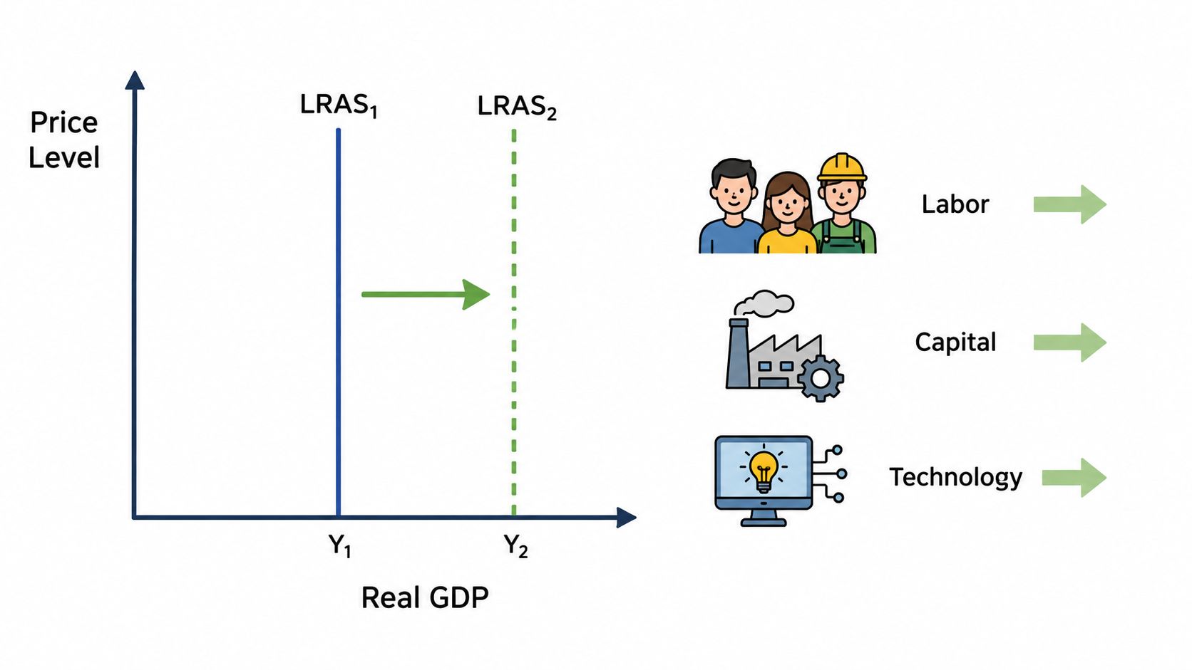
The U.S. economy is a great real-world example. Its LRAS is a vertical line at its potential output, which means real GDP is determined by its production factors, not by the price level. In fact, Federal Reserve data shows that U.S. potential GDP grew at an average rate of 2.3% per year between 1948 and 2023, reaching about $21.4 trillion. This stability comes from the flexibility of wages and prices, which allows the economy to naturally adjust and operate at its full employment level.
Frequently Asked Questions
Even after you've got the fundamentals down, a few parts of the long run supply curve can still feel a bit confusing. Let's walk through some of the most common questions that pop up and make sure these concepts are locked in.
Can a Long Run Supply Curve Be Perfectly Elastic?
Yes, it absolutely can. A perfectly elastic, or completely horizontal, long run supply curve is the defining feature of a constant-cost industry. In these markets, no matter how much the industry grows or shrinks, the price eventually snaps back to the minimum average total cost.
How does this happen? It’s because the industry can get bigger without making its essential inputs more expensive. Imagine an industry like freelance writing. A huge surge in demand can be met by new writers joining the market, but this doesn't really increase the price of laptops or internet service for everyone else. New firms can enter easily, which keeps the long-term price from rising.
Why Would a Firm Keep Operating If It Makes Zero Economic Profit?
This is a classic question, and it trips a lot of people up. The trick is to remember that zero economic profit is not the same thing as making no money. Not at all.
Economic profit is different because it accounts for opportunity costs, what the business owner could have earned doing something else with their time and money.
Zero economic profit simply means a company is earning just enough to cover all its direct expenses (like payroll and materials) and its hidden opportunity costs. This is often called a "normal" profit. It’s enough to keep the lights on and justify staying in business, but it's not so high that it immediately attracts a flood of new competitors.
What Is the Most Common Shape for a Long Run Supply Curve?
While we study all three shapes, the upward-sloping curve is what we see most often in the real world. This reflects an increasing-cost industry, where getting bigger actually makes things more expensive for everyone in that market.
Think about it: most industries eventually have to compete for limited resources, whether that's highly skilled engineers, prime retail locations, or specific raw materials. As the industry expands, that competition drives up costs. This means a higher price is needed to convince firms to produce more. If you're interested in looking at real-world economic data, our guide on projects in statistics is a great place to start.
Struggling to connect theory with practical assignments? Ace My Homework provides expert, step-by-step guidance on complex economics topics, ensuring you build a deep and lasting understanding. Get reliable, plagiarism-free help from verified tutors today at https://acemyhomework.com.